Designed once. Used everywhere. Built for the AI era.
Coop is Sweden's largest grocery cooperative. Millions of transactions a day. Multiple apps, multiple codebases, multiple teams — all moving at their own speed. The ask: lead the design system that ties it all together.
Not just the components. The governance, the process, the docs, the handoff, the tools. All of it.
Client
Coop Sweden
Role
Head of design system
Work
Hybrid (Jönköping & Stockholm)
We designed inconsistency that killed efficiency
Before CDS existed, every team owned their own version of the truth. Coop.se had its components. Coop app had its own. Scan & Pay had its own. Internal tools had their own. A designer in one team couldn't share work with a team three seats away without starting from scratch.
The presentation I gave to get buy-in had one line that landed
"We designed inconsistency that killed efficiency."
The stakeholder response was just as direct: "Vi ska bara kunna spotta ur oss appar i ett jäkla tempo." — which roughly translates to: we need to ship fast and we need to ship consistently. Those two things weren't compatible without a system.
Our vision is to establish an efficient chain of digital experiences, where the project’s deadline does not mark an end, but rather initiates a new era of continuous improvement and development.
The scope
One year in. Seven consuming products: Coop.se, Coop.se/handla (its own codebase), Coop app iOS, Coop app Android, Scan & Pay iOS, Scan & Pay Android, three internal tools — and a fourth on the horizon. Every single development team onboarded. Multiple design colleagues onboarded. All tokens published.
Getting there required navigating Figma Professional → Figma Enterprise, pitching hypothetical efficiency numbers to two management levels above the design team, and finding a developer who actually understood design systems well enough to build alongside me. Most of year one was people work. Earning trust, especially from the design team — who were still shipping without components and not yet convinced they needed to change.
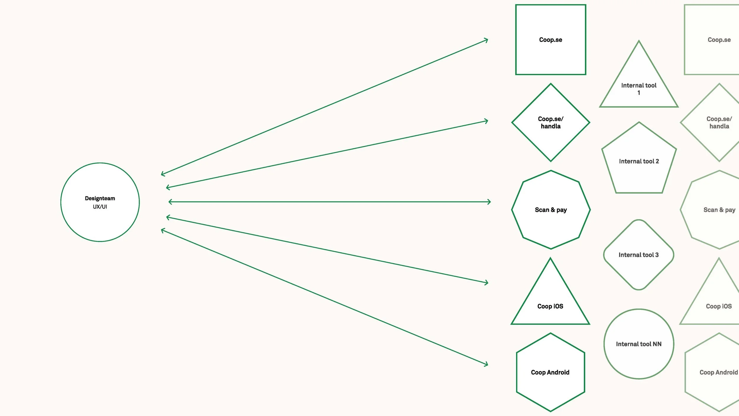
Visualisation of the issue in terms of design team and the workload for all
Token architecture
CDS runs on a primitive → semantic → component token model. A single hex value like #008A14 flows through color-green-600, becomes color-background-brand-primary, then resolves to button-primary-background. Every decision traceable. Every reskin achievable by touching one layer.
Tokens ship as a dedicated npm package: cds-tokens — colors, type, styles, light/dark, multi-brand. Alongside it: cds-components, cds-icons, cds-fonts. Separate packages. Deliberate versioning.
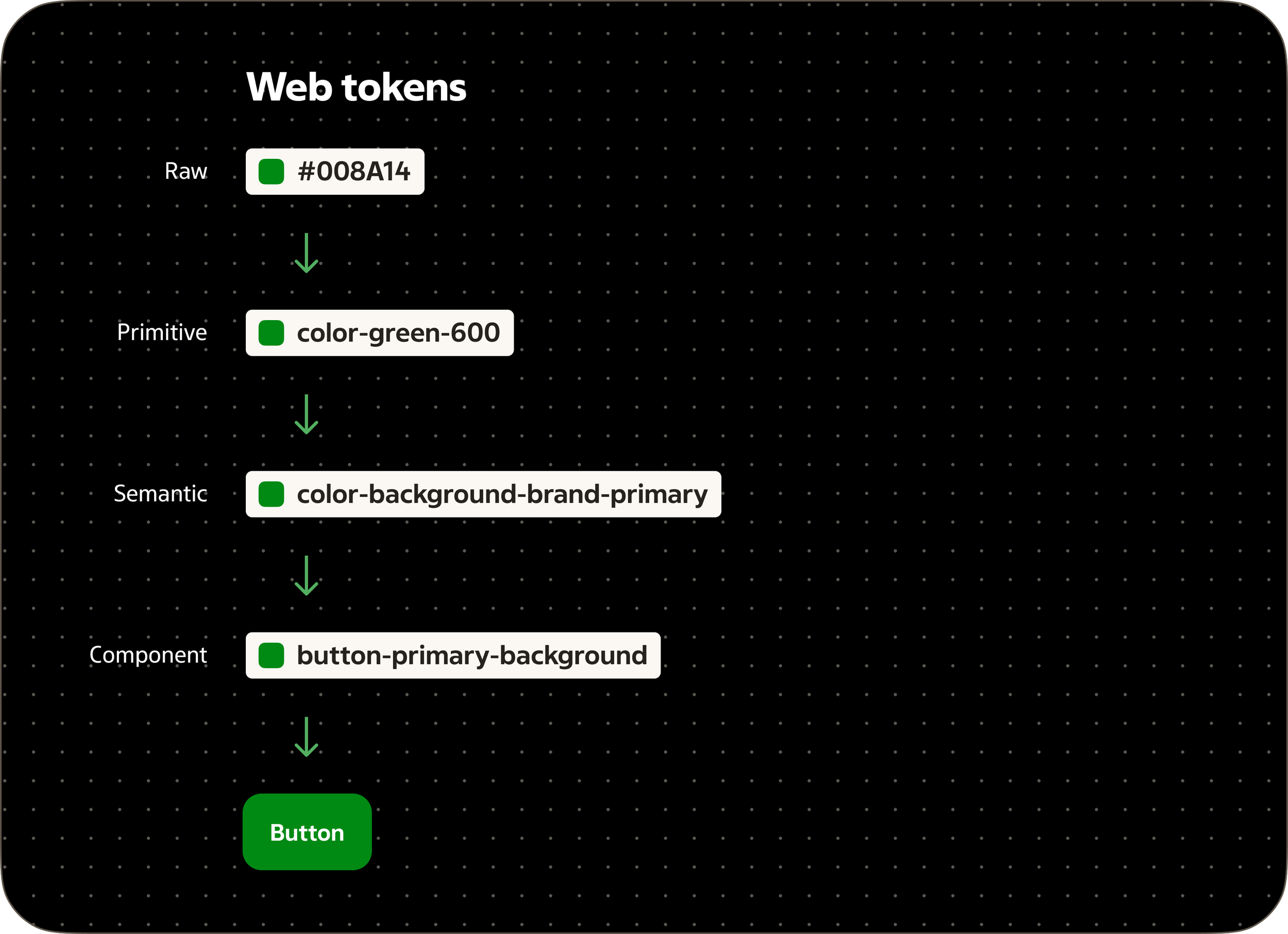
Diagram showing the flow of how our design tokens stem from the rawest source of color to a button component token.
The AI chapter
I developed a theory about AI-accelerated design system work at a previous client, but the tools weren't there yet to test it. At Coop, they were. I pitched it, got sign-off up to the manager of product development level, then built it.
Figma MCP lets me inspect variables, bindings, and component structure programmatically — directly from Claude. Tasks that used to take hours of manual Figma layer-hunting now take minutes. Writing tokenization scripts, checking semantic variable bindings, rebinding nodes in bulk: handled through the console with AI-generated code I specify and verify.
My playground is a Vite + React environment where I consume the CDS npm package directly. I've set up skills and rules for how I want to build inside it. When I need to validate a new pattern, I build it in the playground and show the developer. Not to replace the developer — to close the gap between what I can specify in Figma and what actually makes sense in code.
Figma Code Connect sits in the translation layer between design and development. Components tied directly to the codebase, dramatically reducing AI token usage when developers use Figma MCP to translate designs to code. Less noise. More signal.
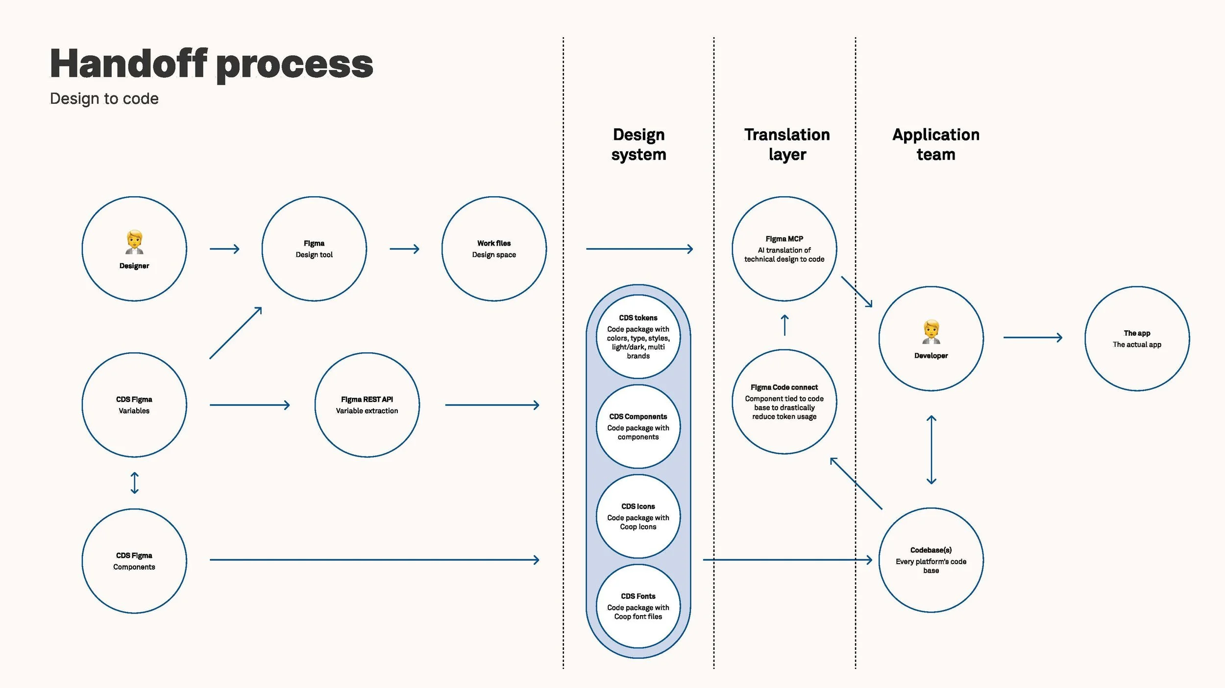
Handoff process flowchart showing design-to-code workflow across three layers: Design System (left) with Designer, Figma Design tool, CDS Figma Variables, and CDS Figma Components feeding into a Translation Layer (center, highlighted in blue) containing CDS tokens, components, icons, and fonts; then to Application Team (right) where Figma MCP and Figma Code Connect guide a Developer to build The app and update Codebase(s).
Governance that lives on
The question I hear most in design system work: "Should this live in CDS?" We made that answerable — a clear decision tree that every team can use without asking me first.
The CDS Support Teams channel gives every team a structured place to log bugs, requests, and feedback. Formatting template, Jira link integration, clear triage. It's not just a channel. It's where governance lives in practice.
designsystem.coop.se is the source of truth for everyone who uses CDS — designers, developers, and increasingly, AI. I designed it, wrote the governance and usage guidelines, and validated every pattern by consuming the CDS npm package directly in my playground. It's designed for both humans and AI — the way documentation is structured matters more now than it ever has.
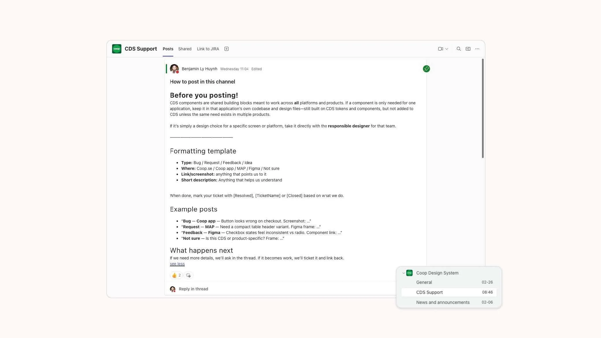
Template of how to post inside the CDS Support teams channel.
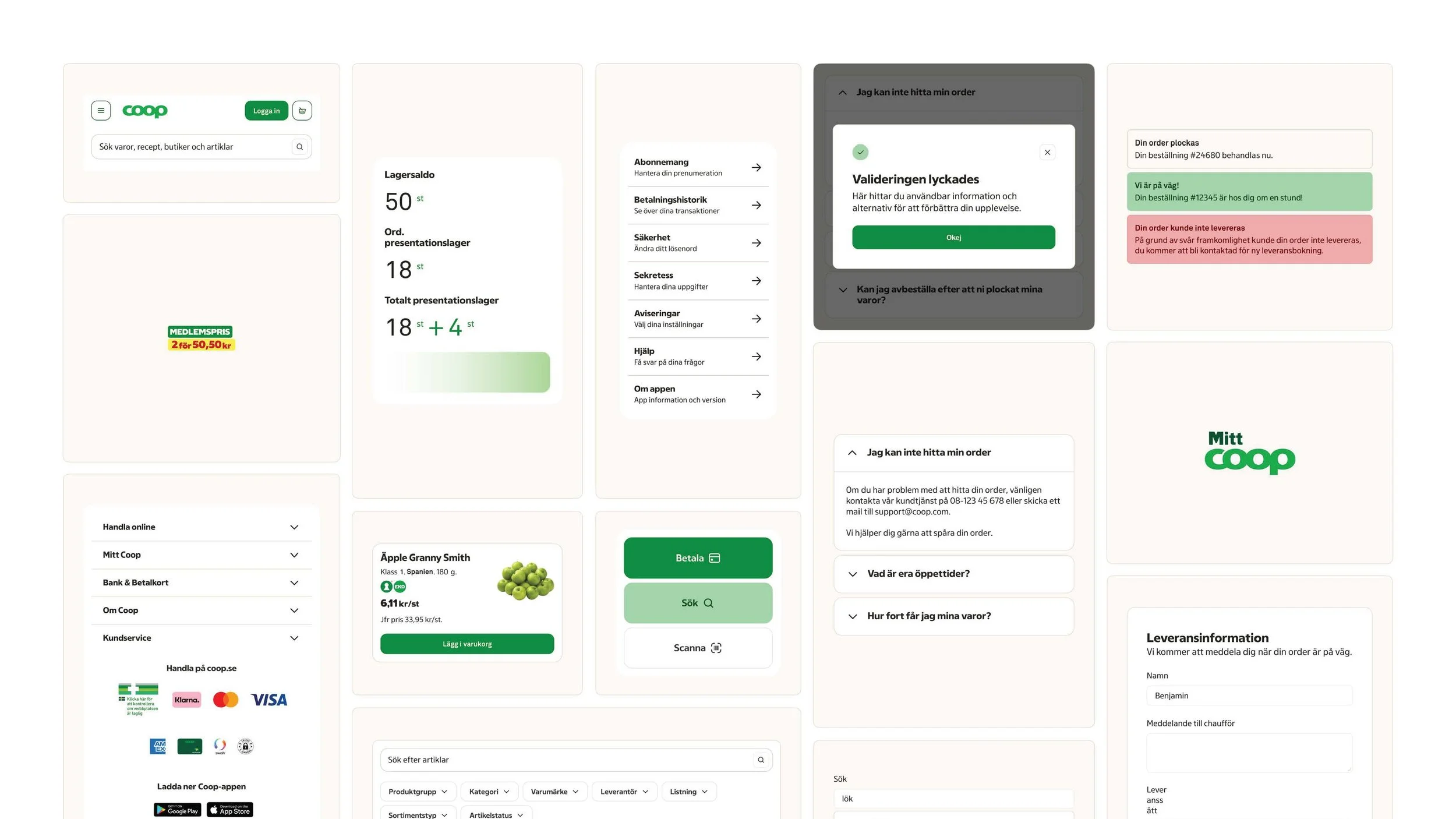
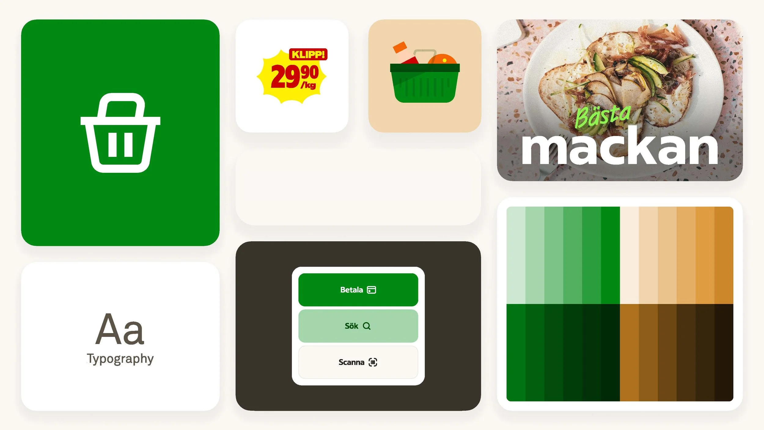
A flat lay of how some components from CDS composed into a bento grid.